Improving the Crystal Ski app experience
The Crystal Ski Explorer app is a vital tool for more than 100,000 ski enthusiasts when they travel abroad for their holidays. It is essential for knowing what to do before travelling abroad, transfers from destination airport to hotels, equipment hire, skiing lessons, things to do around the local area and advice on how to book activities. It also provides tips for beginners and how to get around using local transport in the area.
Before the re-design, the app had a myriad of issues. A 1.8-star rating on the Google Play Store was not a good start. Customer feedback highlighted problems such as outdated information, a confusing layout, lack of detail about ski resorts, and key information being either missing, poorly highlighted, or difficult to find.
My task was to help redesign several of the pages on the app and improve the user experience for customers.
My Role: Researcher, UX Designer
Duration: 3 weeks
Completed: October 2022
Tools: Axure, Figma, Miro, Trello, Adobe
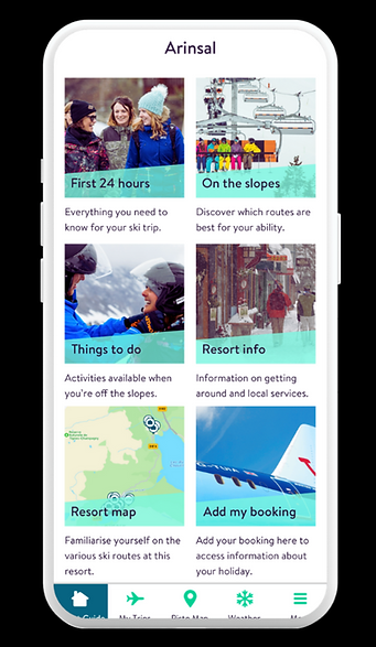
The Problem
The Crystal Ski Explorer app is an essential tool for more than 100,000 people travelling abroad. However, there is evidence that the app is falling short of user expectations. When collecting customer feedback, more than 90% of comments were negative. Common complaints included outdated or incorrect information, an unintuitive layout, missing or hard-to-find content, and lacking detail. These issues cause a lack of trust, forcing users to verify information elsewhere. As a result, the app fails to deliver value to users when they need it most.
The Challenge
Work alongside a third party development team to re-design the app in a way that is genuinely useful and appreciated by customers.
Deliverables
-
UX research, including competitor and comparator analysis
-
A design studio, getting stakeholders involved to help contribute to improving the app experience
-
Usability testing with ski customers
-
Usability testing report
-
High fidelity mockups within a tight deadline (before the next ski season started)
Outcomes
-
Project completed within projected timeframe
-
Working with the UI designer to produce high fidelity mockups
-
Working closely alongside developers to ensure proposed designs would be possible (spoiler...some of them were not)
Discover & Define
Crystal Ski, a sister company of TUI, provide package ski trips for customers. An important part of these holidays is for customers to use the Crystal Ski Explorer app. The aim of the app is to help answer any questions, provide useful information about ski lessons, equipment hire, lift passes etc, and offer tips on various activities around the resorts.
The app had been live for a few years, but had been receiving heavy criticism from customers and had the feel of a half-completed school project. I was tasked with redesigning the app with the following criteria:
-
How can we ensure the app relies less on copy, and more on visuals and making it easier for users to find what they're looking for?
-
How can we bring the app to life more? It currently feels a bit soulless.
-
There is a heavy reliance on the app for knowing what to do 48 hours prior to the holiday and the first 24 - 48 hours of arriving at the resort. How can we make this information easy to find and more digestible?
-
How can we use the app to alleviate the burden from resort reps of being asked questions by users?
An initial UX review showed just how poor the current app experience was. Grammatical errors, links that weren't clickable, outdated contact numbers, content so dense it would take a whole book club to work out the meaning and inconsistencies with header and font sizes were just a few of the many issues.

I was excited to begin, but a deadline loomed. The ask was for the app to be re-designed by the time the next ski season began. This was in 3 weeks time...prioritisation would be key.
Early stages of this project included competitor/comparator analysis an empathy mapping session with some fellow designers, using personas to put ourselves in the customer's shoes to look through the app, research into best practice for apps, and trawling through Google reviews of the app.
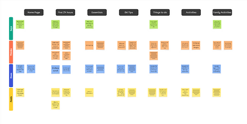
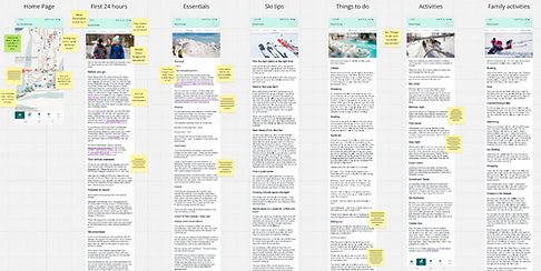


Above: Initial work involved an empathy mapping exercise, research, looking at customer reviews and competitor/comparator analysis.
Link to full Miro board here. (Password: CrystalSki2022)
Develop & Deliver
To kick off the next phase I led a design studio with key stakeholders across the app. I always find that running these types of sessions will help people collaborate and can spark creative and potential design solutions early on. Participants included fellow designers, the product owner, product manager, analyst, and insights manager. Together, we worked through a set of pre-defined “How Might We…” statements, for example How might we create more digestible content?
The design studio provided some great ideas, which I grouped into themes.


Above: Some examples of sketches from the design studio with stakeholders
I was very aware of the impending deadline and knew it was important to move prioritise wireframing and prototyping, ready for the next step, usability testing. Using Figma, I started to refine these ideas and build a prototype. I set out a variety of research questions to help guide the testing sessions and highlight any issues with the initial designs. These included:
-
Would the app help inspire and build excitement for users in the lead up to their trip?
-
Is it clear what the first 24-48 hours of their trip will look like once they arrive?
-
How easily can users navigate the app and find the information they need?
-
How easily can they read through the content?
-
How easy is the resort map to find within the app?
Once the design was ready, I conducted the usability testing. To summarise, participants were able to find information in the app with ease and had no issues navigating around different pages. Participants mentioned finding the design easy to use and the information was easy to find. There were a few takeaways, including some adjustments to copy and requests for more information about the reps at the resorts.
Link to full usability testing report.

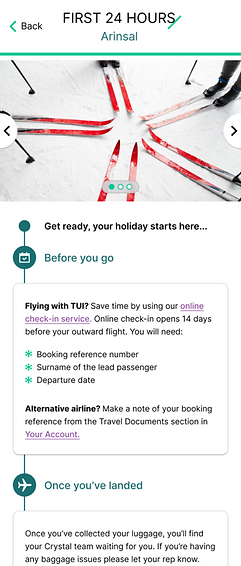
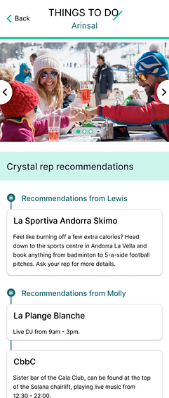

Above: Examples of the pages that were usability tested
With design updates complete, the time came to share what I had done with the third party development team. One of the lessons I took away from this project was to share designs as early as possible when working with development teams. I walked in, full of optimism. I was told that a lot of the design work would be difficult to accomplish in the timeframe. I walked out despondent.
There was just under 1 week left before the deadline. The new plan was to design the pages with a a minimum viable product (MVP) approach. This was a disappointing setback, but I worked hard within those final days and, along with a UI designer, produced the final designs.
In the final few days, some good news arrived. I was told that the development team had gone away to do a deeper dive into the designs and, on reflection, some of the original designs would be used. Great stuff!
Outcomes & Conclusion
The re-designed app went live that Winter, just before the next ski season. Feedback from stakeholders was incredibly positive about what customers had been saying about the re-designed app. It was now a lot easier to navigate, find information and the UI looked so much better.
Since that initial launch, we have iterated on the app, working closely alongside the development team, making small improvements such as new splash pages and improvements to the 'weather forecast' pages.


Above: The original 'Homepage' on the left vs greyscale wireframes vs the final design for the Homepage
Right: The original 'First 24 hours' on the left vs greyscale wireframes vs the final design. Using the updated design, I was able to chunk the content to make it easier to read, and significantly reduce the height of the page to prevent it feeling like an endless scroll...


